Approach
With Capabuild’s continued growth the existing brand felt removed from what they stood for and fell short in demonstrating the quality of the outcomes they deliver. Our challenge was to take the Capabuild brand beyond the idea of just building spaces to work.
To highlight their considered approach, our response was driven by the single idea of ‘creating spaces to thrive’. From the end-users who occupy the spaces and the businesses that grow within them, to the Capabuild team that builds and manages them, the goal is to create spaces that maximise potential.
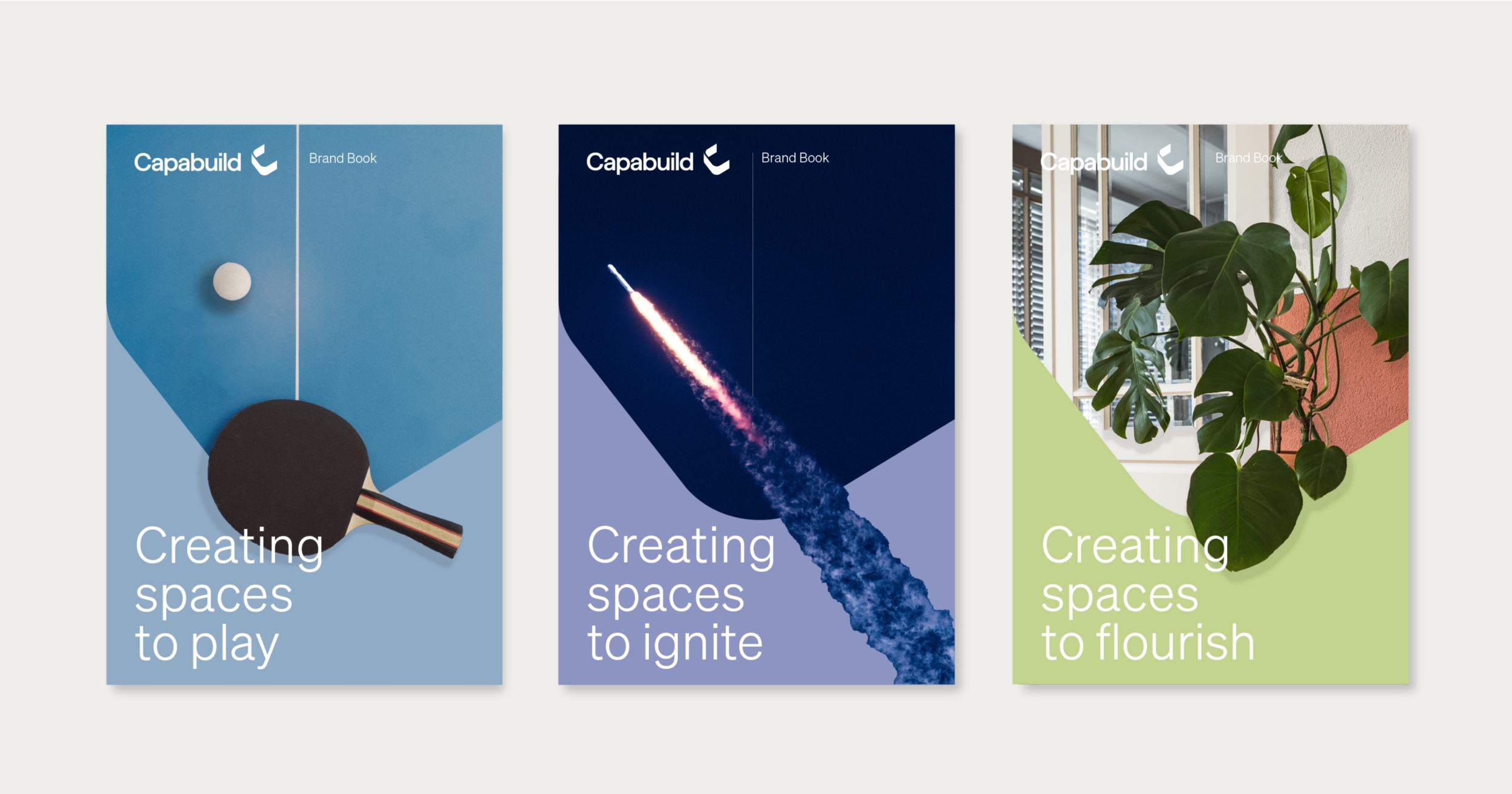
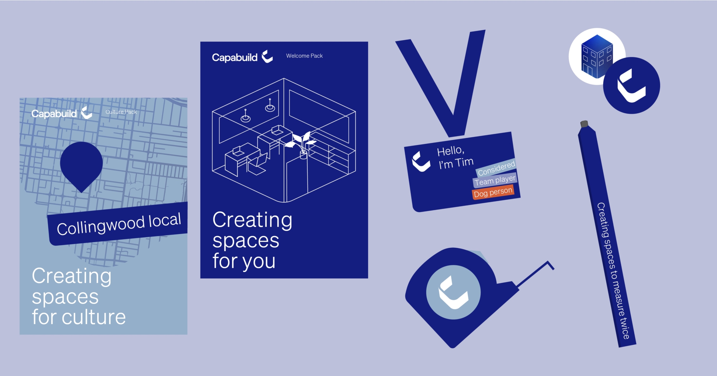
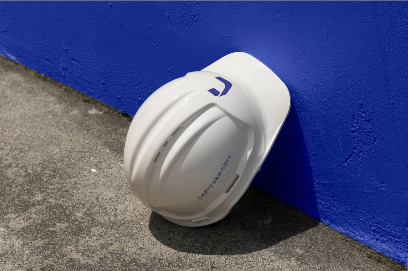
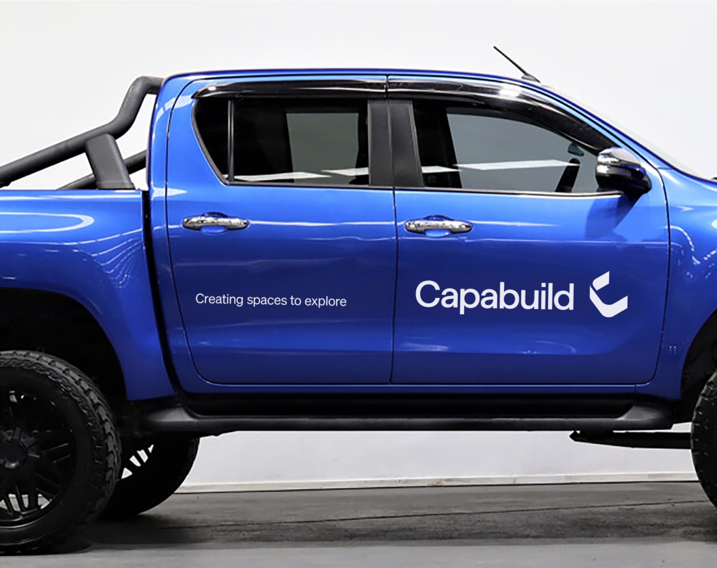
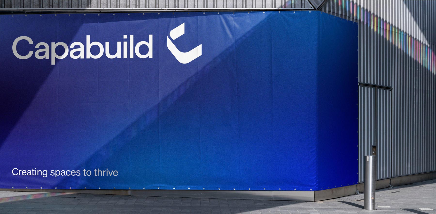
We expressed the brand idea of ‘creating spaces to thrive’ through every part of the identity. An animated blue gradient colour symbolises the energy, flow and movement within the spaces they build to illustrate their people-centric approach. A confident and simple tone of voice clearly highlights the benefits and positive outcomes Capabuild brings to each of their projects.
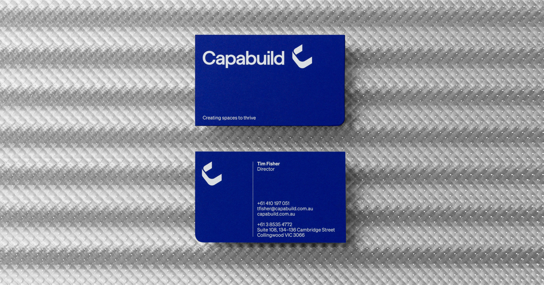
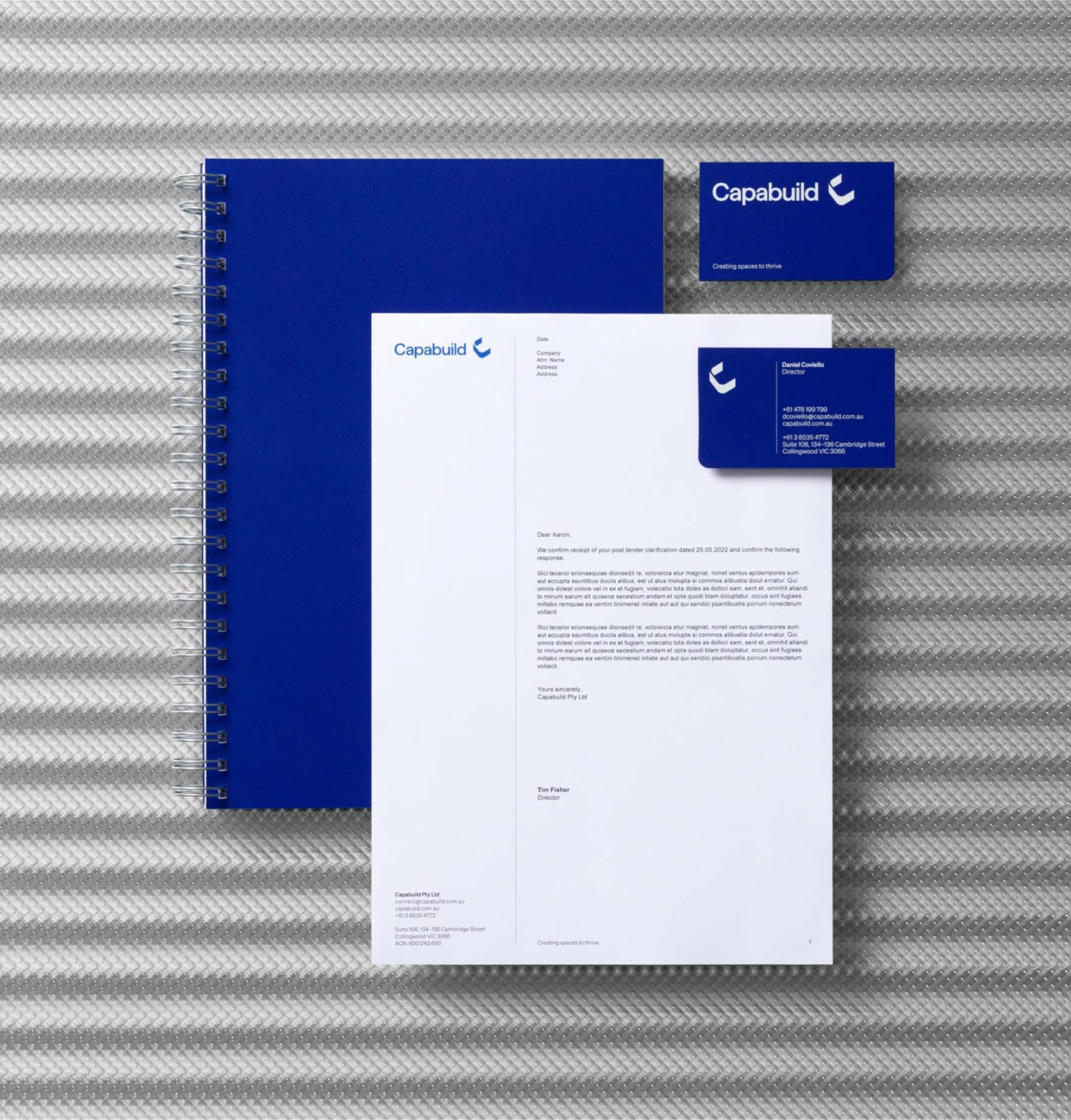
At the core of the identity is the logo icon which implies the shape of a room within the letter C.
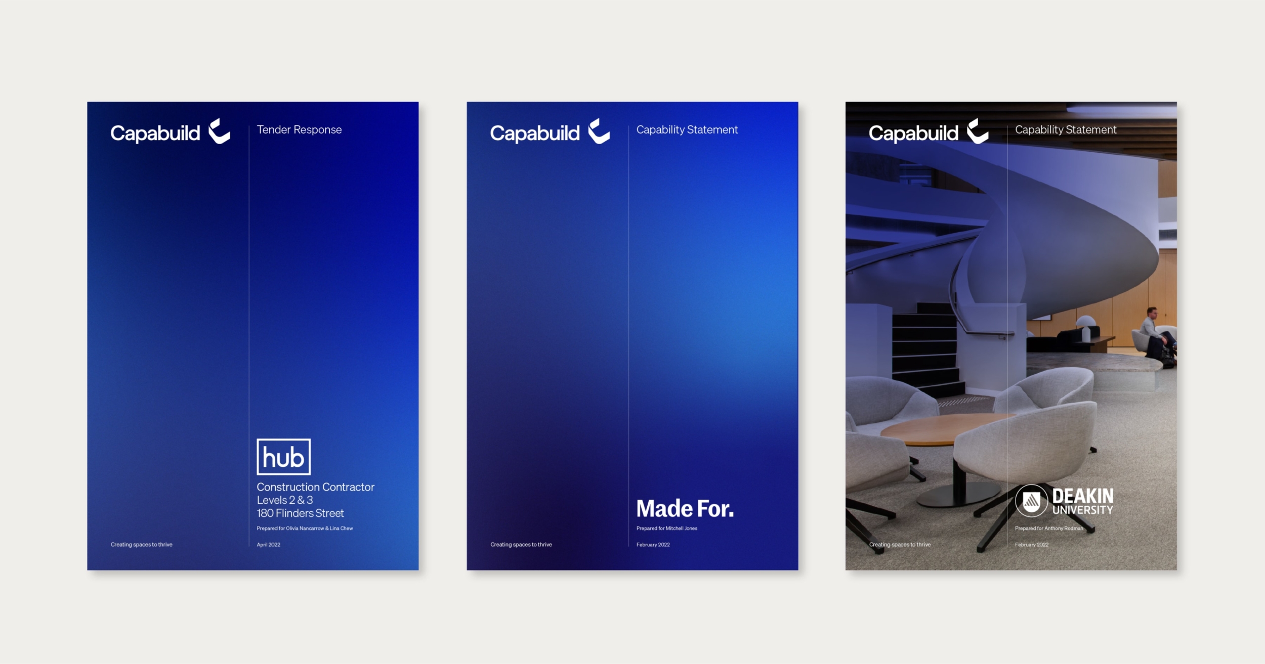
We designed and developed the Capabuild’s new website to not only showcase their successful project outcomes but also elevate the personality and experience of working with or for Capabuild.

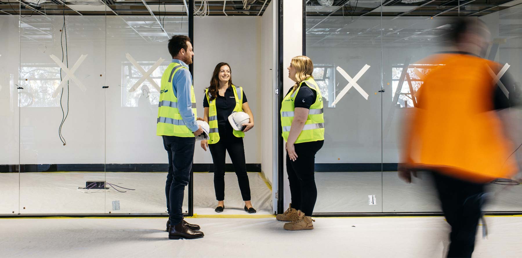
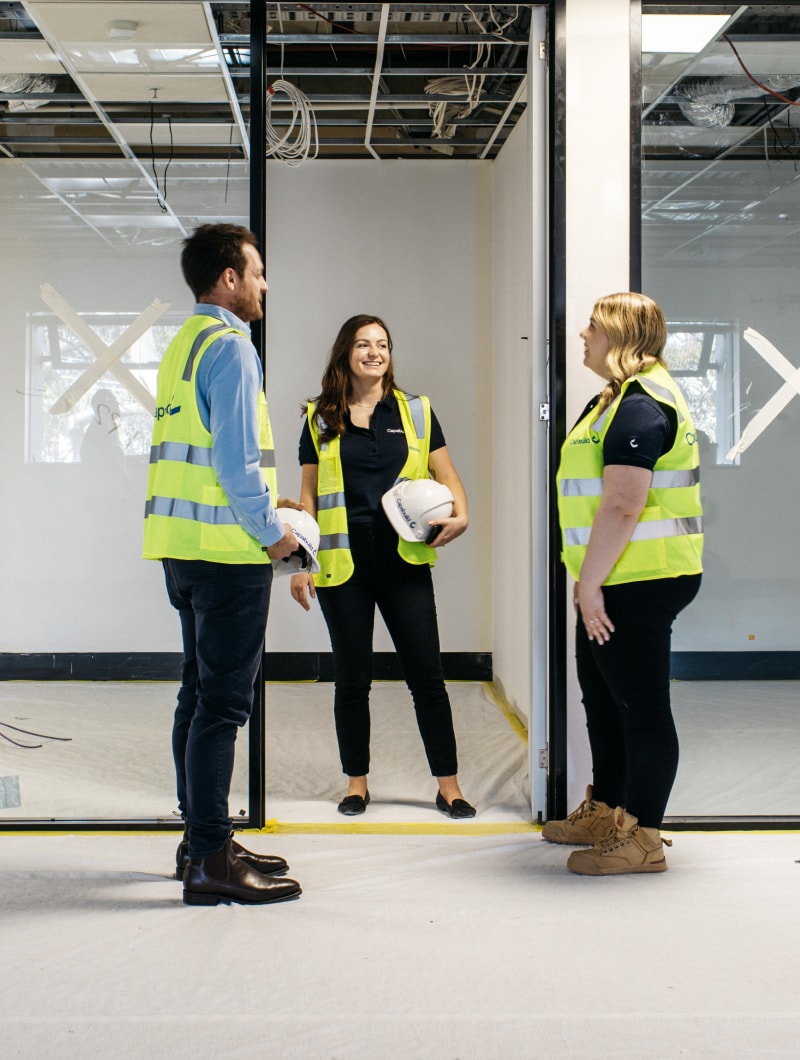
Working with photographer Marie-Luise Skibbe we captured the true essence of Capabuild with an extensive photo library of the team at work onsite and in office.
