Approach
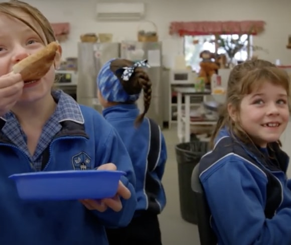
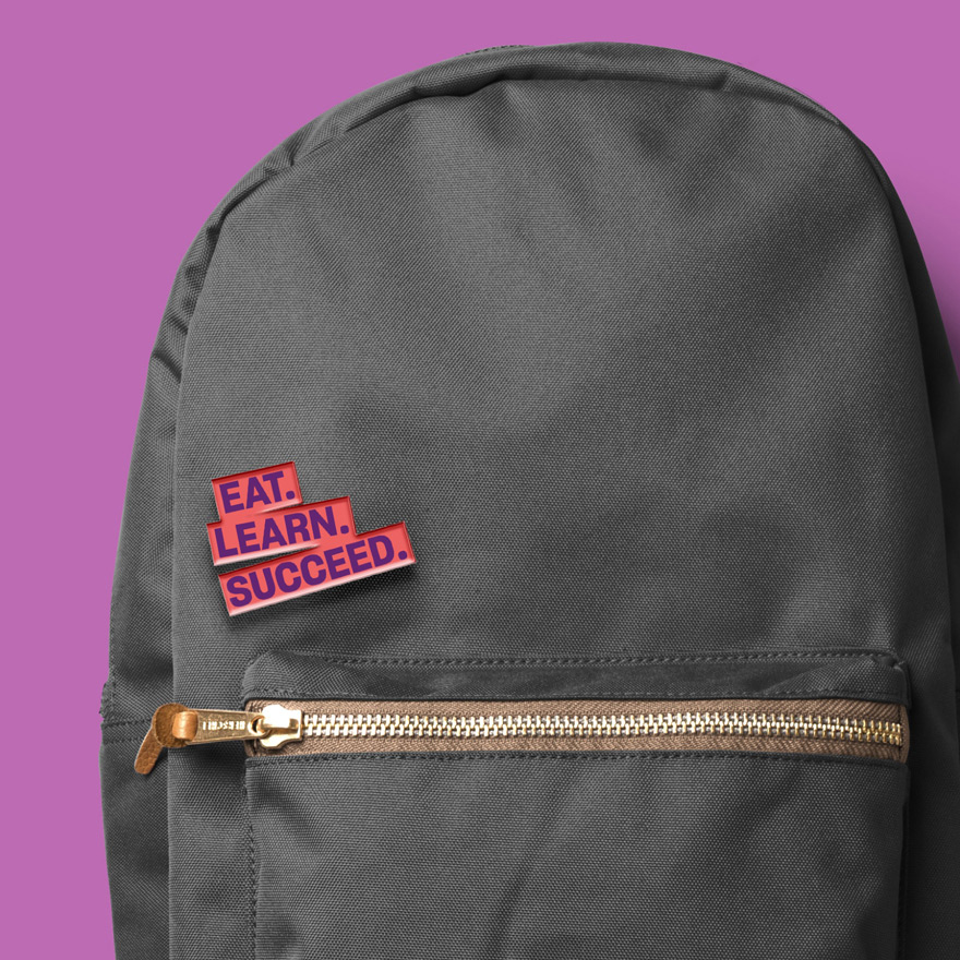
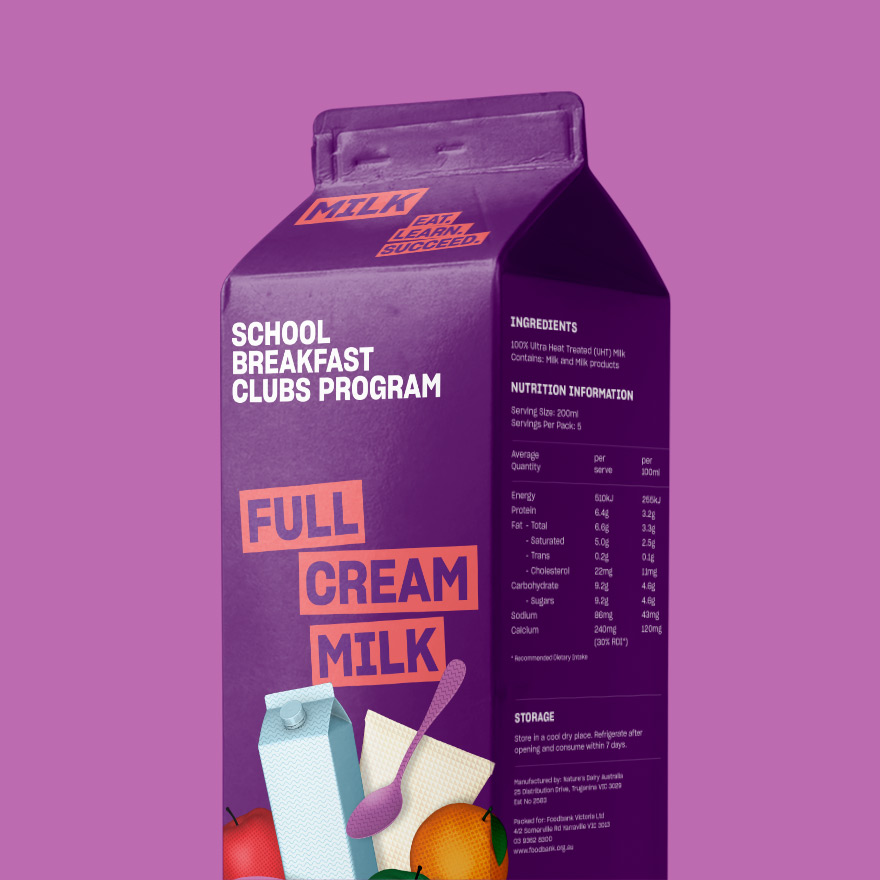
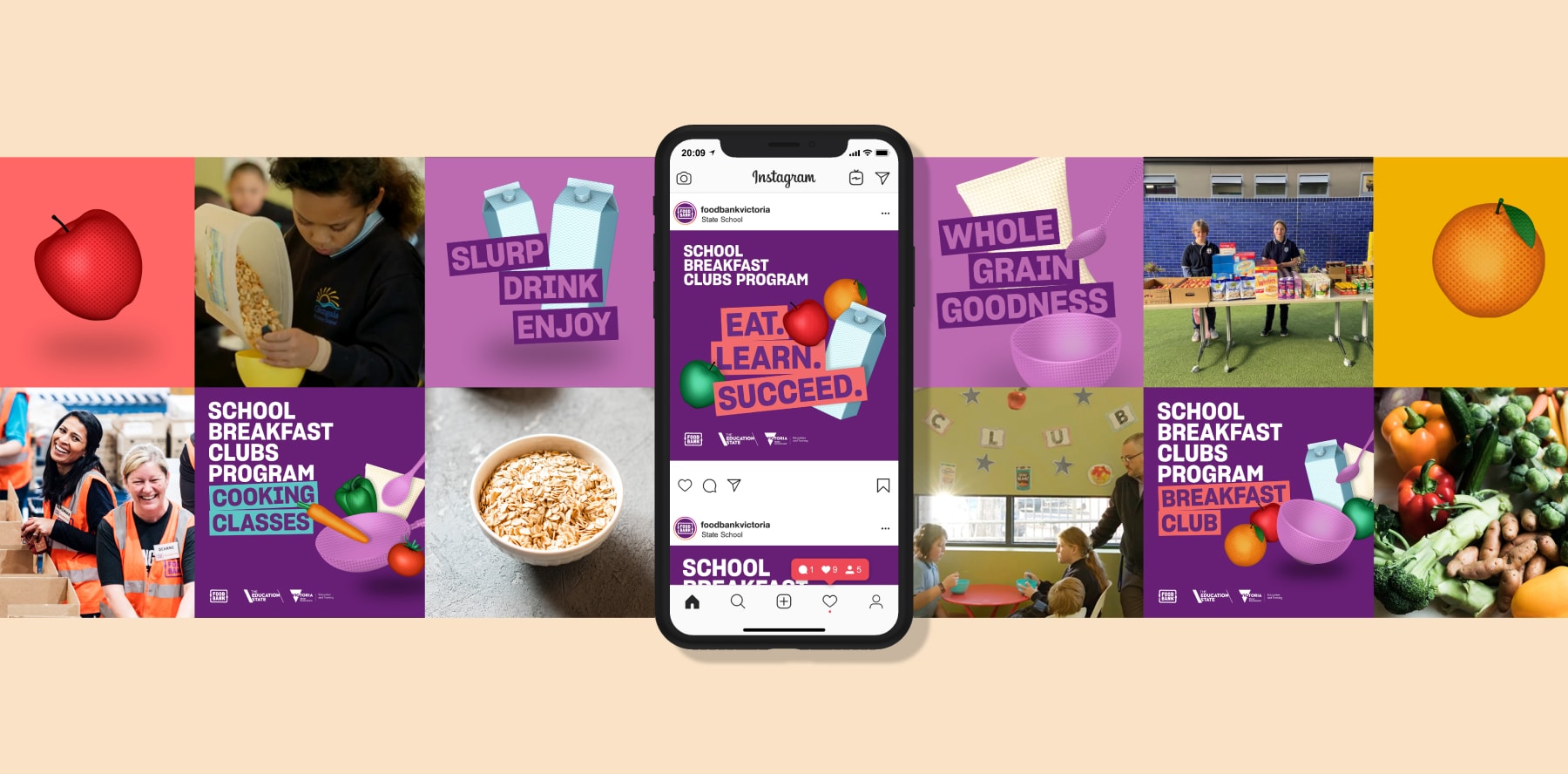
The brand we created is immediately recognisable, consistent, and dynamic. ‘Eat, learn, succeed’ is our approachable and memorable three-word mission that sets a decisive tone for the campaign.
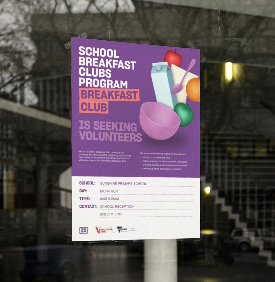
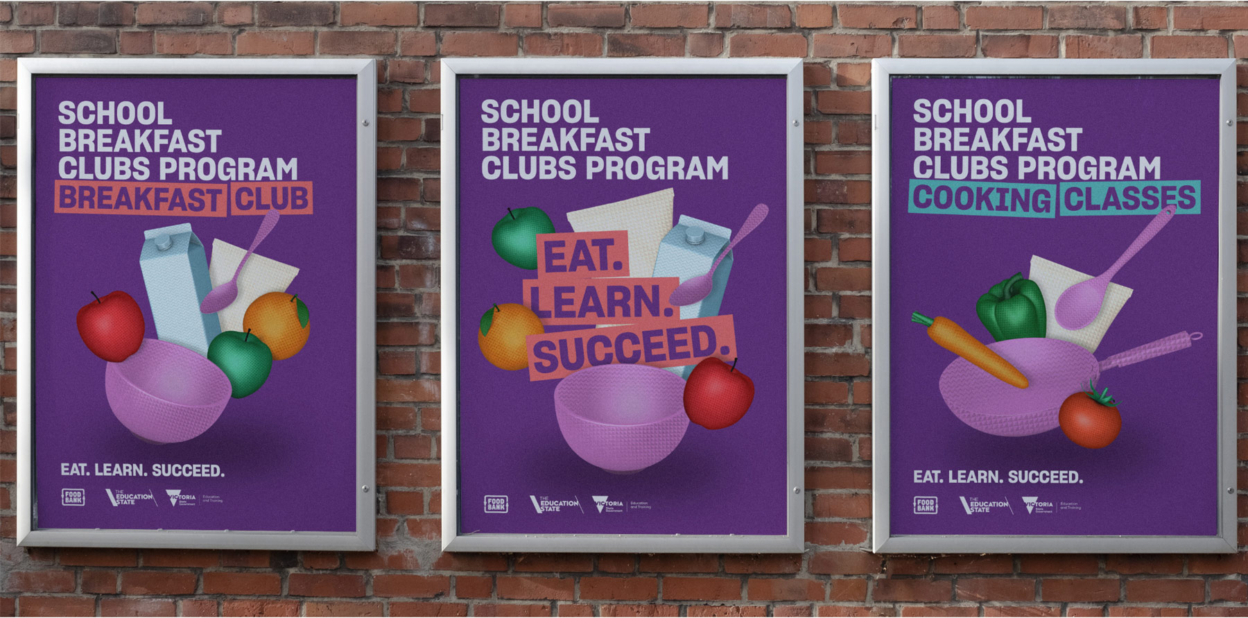
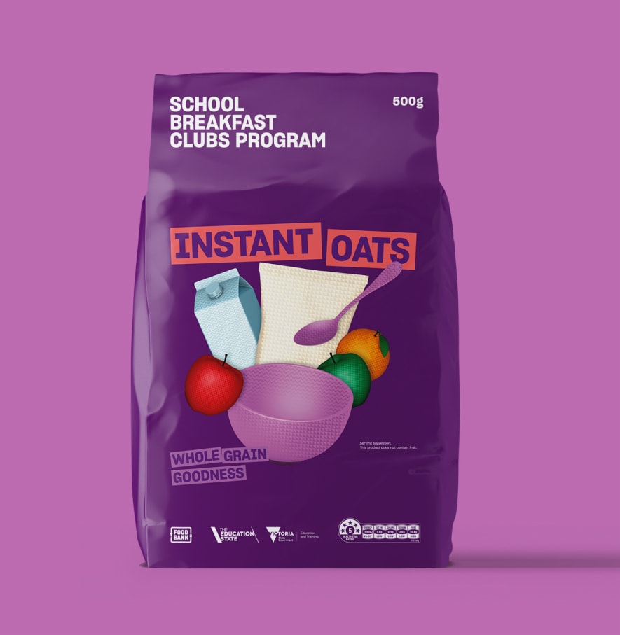
Depicting the foods that fuel the Program, we developed a set of three-dimensional graphic objects and patterns in-house to add depth to the identity. Arranged in dynamic compositions, graphics embody the boundless energy and opportunity that a nutritious meal delivers.
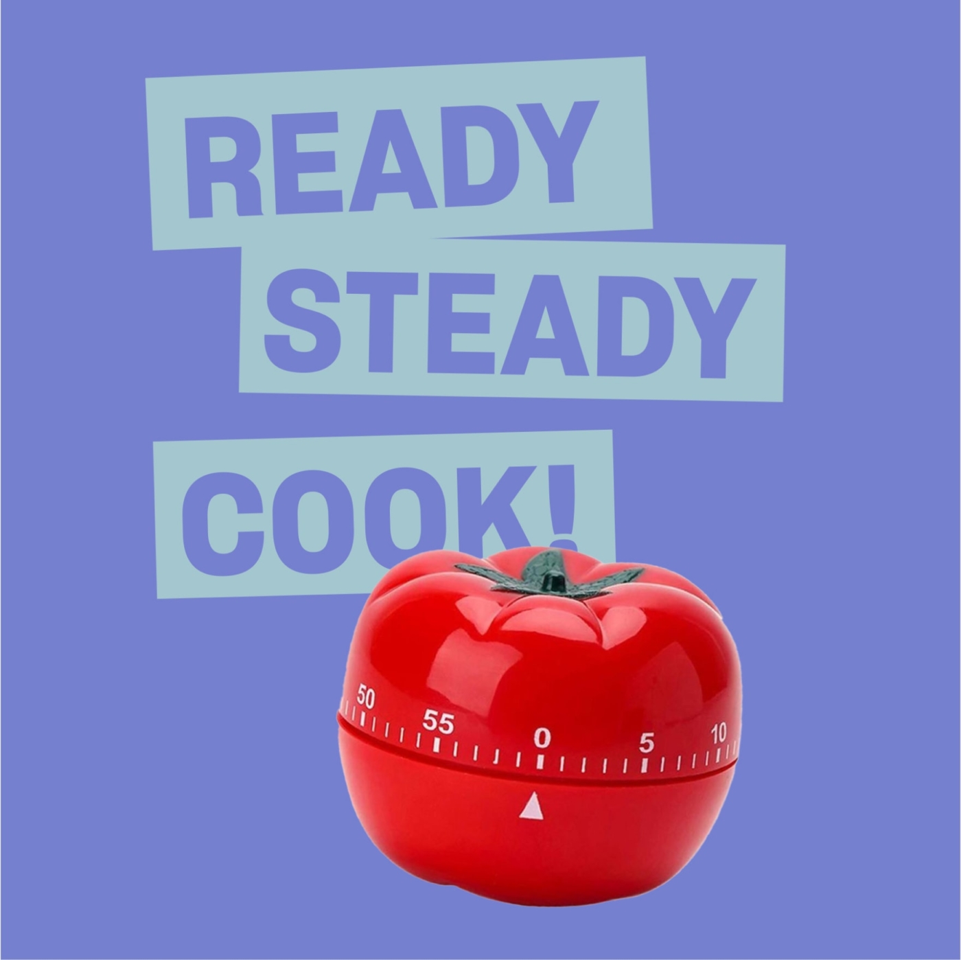
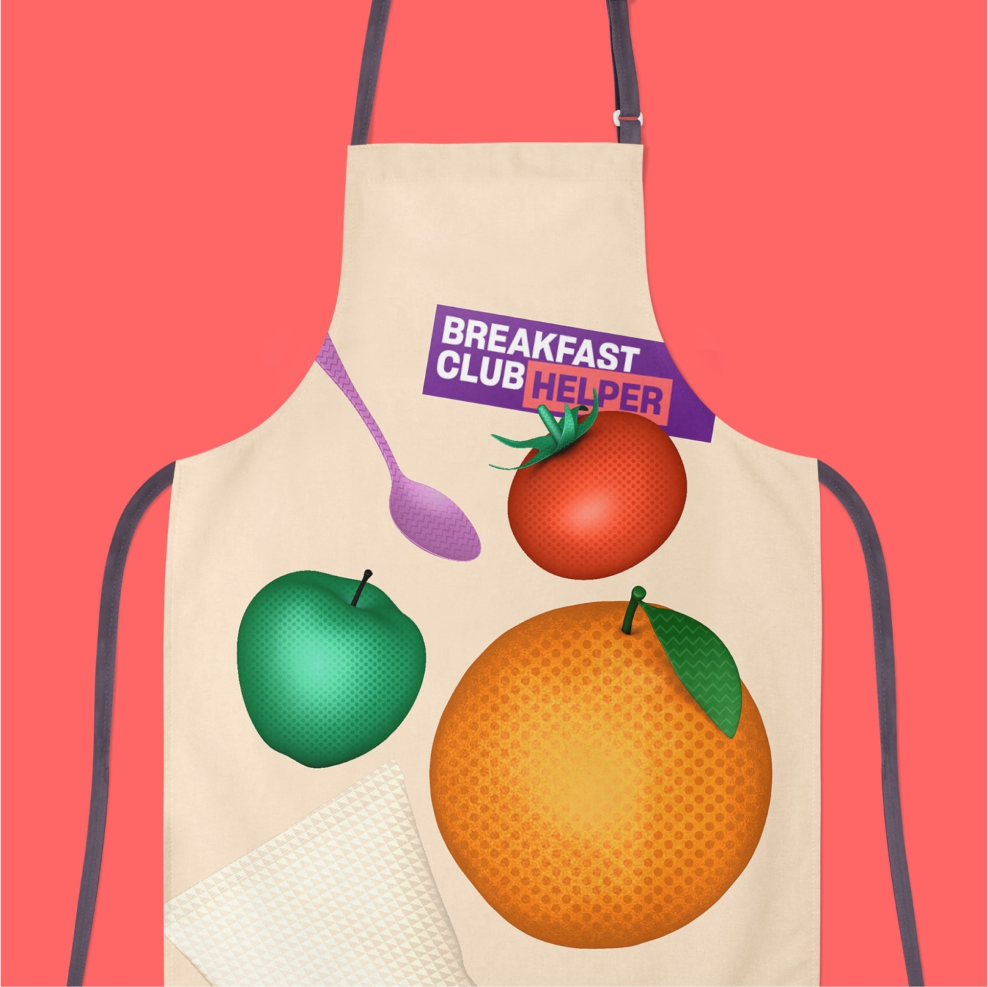
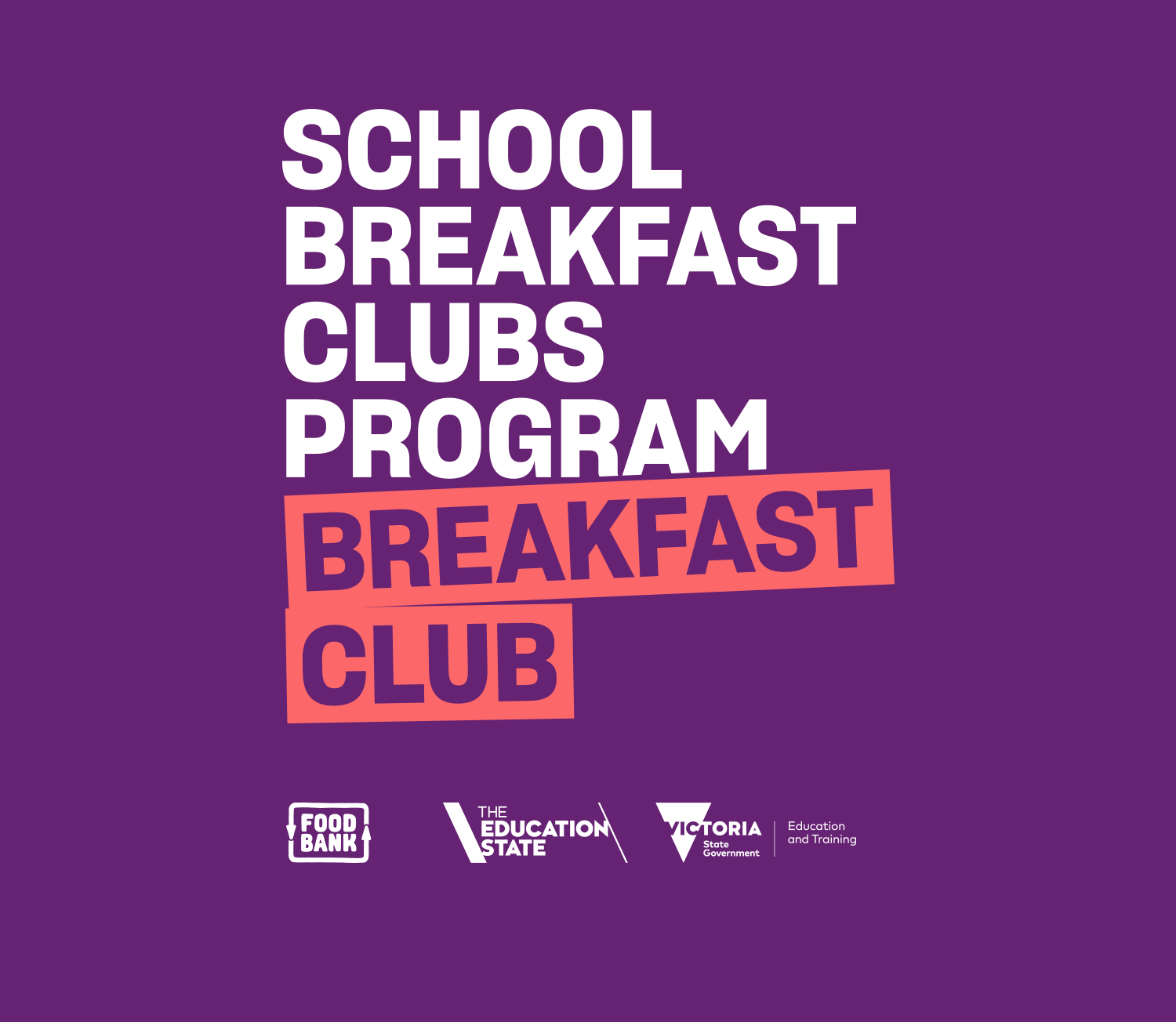
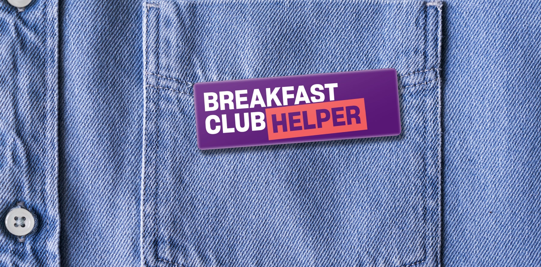
Breakfast should never be dull, and our vibrant palette of colours draws from fresh ingredients. Bold Berry purple leads the pack – a direct reference to the Foodbank primary colour. Granny Smith green, Bean Sauce red and Cool Milk blue add juicy splashes of flavour across numerous applications, including posters and a comprehensive packaging range.
We designed and built the updated website, the primary tool to engage schools, teachers, pupils, and parents. The playful touches of the brand were brought to life through integrated animation and interactive rollovers.
The website also provided information on the sister program ‘Cooking classes’ and provided recipes and fact sheets.

Outcome
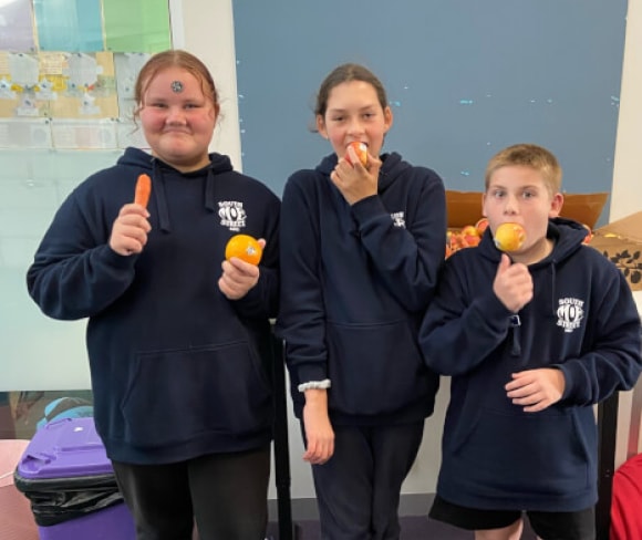
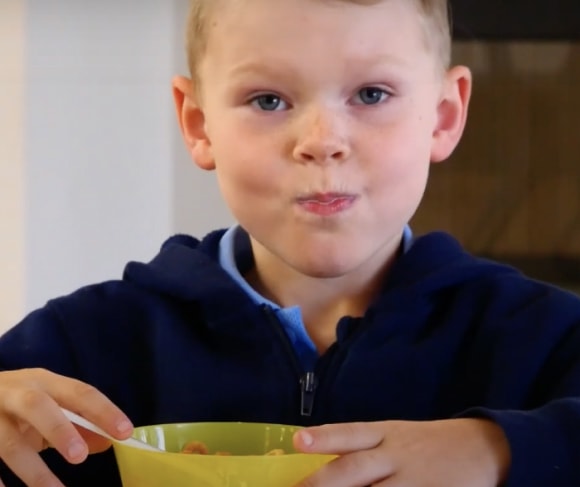
The School Breakfast Clubs Program brand and website was enthusiastically devoured by schools and the community. With the program only launching in mid-2022, there have already been a significant number of enquires matching expectations. Current indications are that target KPIs will be surpassed and expectations outperformed.